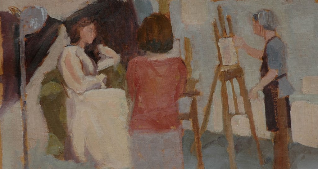
 Today I went to my figure class to paint the same girl . . . again. We paint the same model for four weeks. I decided I would paint the model but also include some of the other students. So yesterday I cut a piece of linen canvas and taped it to a big piece of cardboard. In my mind the composition would be a long horizontal one. I thought the model would be in the middle of the painting but when I got to class I walked around and decided I liked her way over to the left side of the painting. I’m not quite finished, the model is sitting on a chair on a model stand, I need to put in the model stand.
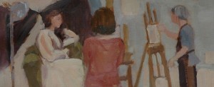
Below is another version, same thing but cropped more. I am trying to include only the essentials of the scene, in this case “art class”. Perhaps the cropped version has more interesting abstract shapes? Is there really anything gained by including that bottom 20% of the painting that I’ve cut off in the image below? These are the questions I ask myself when I decide on composition.
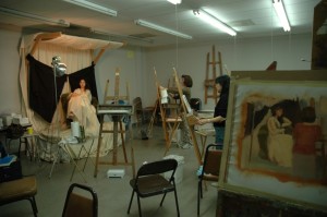
Below is one more photo, the actual classroom. The art students I was painting have moved around, today we ended up doing some 20 minute poses, so even the model is in a different position from my painting. Luckily the art students didn’t change positions until the last half hour of class so I was able to paint them. I set up my easel as far off in the corner as I could!
 I would love to hear which version you like best? The first one or the one that’s more cropped? The painting is approximately 10″ high and about 18″ wide. Oil on canvas. Thank you! Joan
What a fascinating post!! Wow lately you’ve been making me think so much…. my brain may explode!!
I REALLY like this painting. As to whether I like the cropped better than the original…. I’m not sure. I’m THINKING that the first allows you to really see that you are looking at the back of an art student while for some reason, that is quite as convincing in the second….. can’t tell you why.
I can’t wait to hear what everyone else thinks.
Hi Joan,
I like the first one the best. I like the way you have incorporated the other artists into the painting. Great job on the easel of the far artist.
Hi Marian, What a nice compliment you pay me when you say my posts make you think! As far as which version is best, it may be a case of me being too close to the painting to really be able to “see” it. Thank you for taking a fresh look at it and sharing your thoughts.
Joan
Hi Rhonda, thank you for stopping by and for you comments. Thanks for your kind words,
Joan
Great post, Joan. Thank you for sharing the room in context with your painting. My vote would be for the second, cropped painting. It is very interesting graphically, especially with the woman with the red shirt in the center. Very expressive.
First one, because the artist on the right is anchored in space.
Well, I’ll just go on the record here: The first one! I think it’s easier to recognize what’s going on there a bit easier. You do a wonderful job blocking in those big patches of color, Joan. Really nice.
I made my decision before reading the other posts – I like the first one. Lovely painting(s)! I find it very interesting that the focal point changes in each painting. In the first one, I am drawn to the painter and easel. In the second one, I am drawn to the woman’s back on the center of the painting. In the last painting, I notice the model first. So, I think that must be why most of us “artists” like the first one … we like the painter at the easel!
Now that I’ve re-read my post I realized that I mis-typed. I meant to say the second one ISN’T as convincing as the first.
But I still don’t know why.
Hi Joan,
My vote goes to the cropped image. You’re right, the full image has too much floor and legs of easels to be interesting- the lower area is cluttered. The negative space around the figures seems trapped.
Graphically, the cropped one provides a more intimate space, with more depth created by the sizes of the figures. The field is broken rhythmically, rather than swirling around objects with no place to rest the eye.
If you’re looking for more interesting abstraction, go with that.
Hi Melinda, Sarah and Diane, thank you all for your votes! I appreciate everyone taking a look at the different versions and then taking the time to give me your opinions.
Joan
LSaeta, thank you for your comment and especially for taking the time to explain how your focal point changes with each different version. So interesting to hear this, thank you!
Joan
Hi Edgar,
You really ought to be an art critic! Thank you for your very astute observations. I think I’ve learned that what makes a “good painting” has a lot to do with the message or initial inspiration of the artist and what the artist is trying to convey. The full version here makes a good description of an art class, but the cropped version is a better painting in the abstract sense, which was my initial intention.
thank you,
Joan
Hello Joan,
I like the initial composition. The bluish purple of the student on the right complements the purple of the skirt of the student in the middle, and draws the eye around. The shape and direction of the middle student’s skirt points towards the model, thus directing the eye. I like the somewhat unfinished/undetailed nature of the middle student’s skirt. It serves to direct the eye, but not distract.
Well done 🙂
One other comment… the length and shape of the model’s skirt aligns with the middle student. They blend together somewhat and draw the eye upwards to the model’s face. That combination is what really works.
Cheers, Kerry