 I am still focusing on stopping earlier rather than later with my paintings. I am enjoying leaving more of the brushstrokes visible. The Abstract Expressionists appreciated paint for paint’s sake and not just for what was represented with the paint. I’m a long long way from abstract expressionism here but when I make a beautiful thick mark with my loaded brush, I am trying to leave that stroke just because it’s a beautiful expression. Sometimes, though, I do have to lose those nice strokes because they’re either a.) in the wrong place or b.) the wrong value or color, but the more I paint the more I’ll make those marks “correctly” the first time. At least that’s the plan.
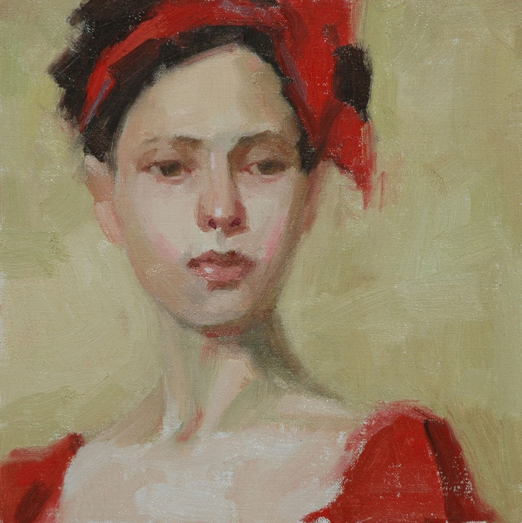
This painting is 10″x10″ oil on canvas. Just a little larger than my last one which was 8″x8″. I’m still a little scared of the larger canvases with this new batch of figures. Right now I just want to practice painting faces and not have to put a lot of time into entire compositions.
Its marvelous. Don’t do a thing in your style here on out, don’t change a thing, keep going like you are, you are doing it just the way it should be. It reminds me of crossing Carole Marine with Malcolm Liepke.
Gorgeous!
Well: I will not argue with that lovely red.
It’s a lovely painting, Joan, and good you have uploaded with a larger file size…you can really see all those luscious brush-strokes!
You are very sensible working at a scale you feel you can handle and learn much from.
Wish I was as sensible, then I might also learn without getting so far ahead of myself :o{
Absolutely beautiful, Joan.
Tina, thank you for your wonderful compliment. I looked up Malcolm Liepke and what a compliment!
Diane and Red-Handed, thank you for visiting and taking the time to post such nice comments!
David, my sense is running out since I’m already planning a larger painting. It’s just so hard not to push with painting, whether it’s size or some other aspect of painting. Thank you for your compliments.
Sheila, thank you for your nice compliment.
Joan
I really like this painting. Even though it is asymmetrical, the negative space on the right balances it. I also like that you are consciously including the brushstrokes in your composition; not everyone can do that successfully like you.
Joan, your portraits just get better and better! I really like this one. She has a lovely far away look. Very nice!
I love this red ribbon painting… and all of the others too… Wow.. you have been busy!!
This is really beautiful. I just found your blog by accident. Love your paintings.
I disagree with Tina Steele Lindsay it is nothing like crossing anything with anyone, you have a diffinative style all your own. This work would touch the depth of anyones soul. I applaud you. A fan